Widget Views
The Inventory Widget supports multiple display views to suit different design preferences and user experiences. Choose the view that best fits your store's layout and customer needs.
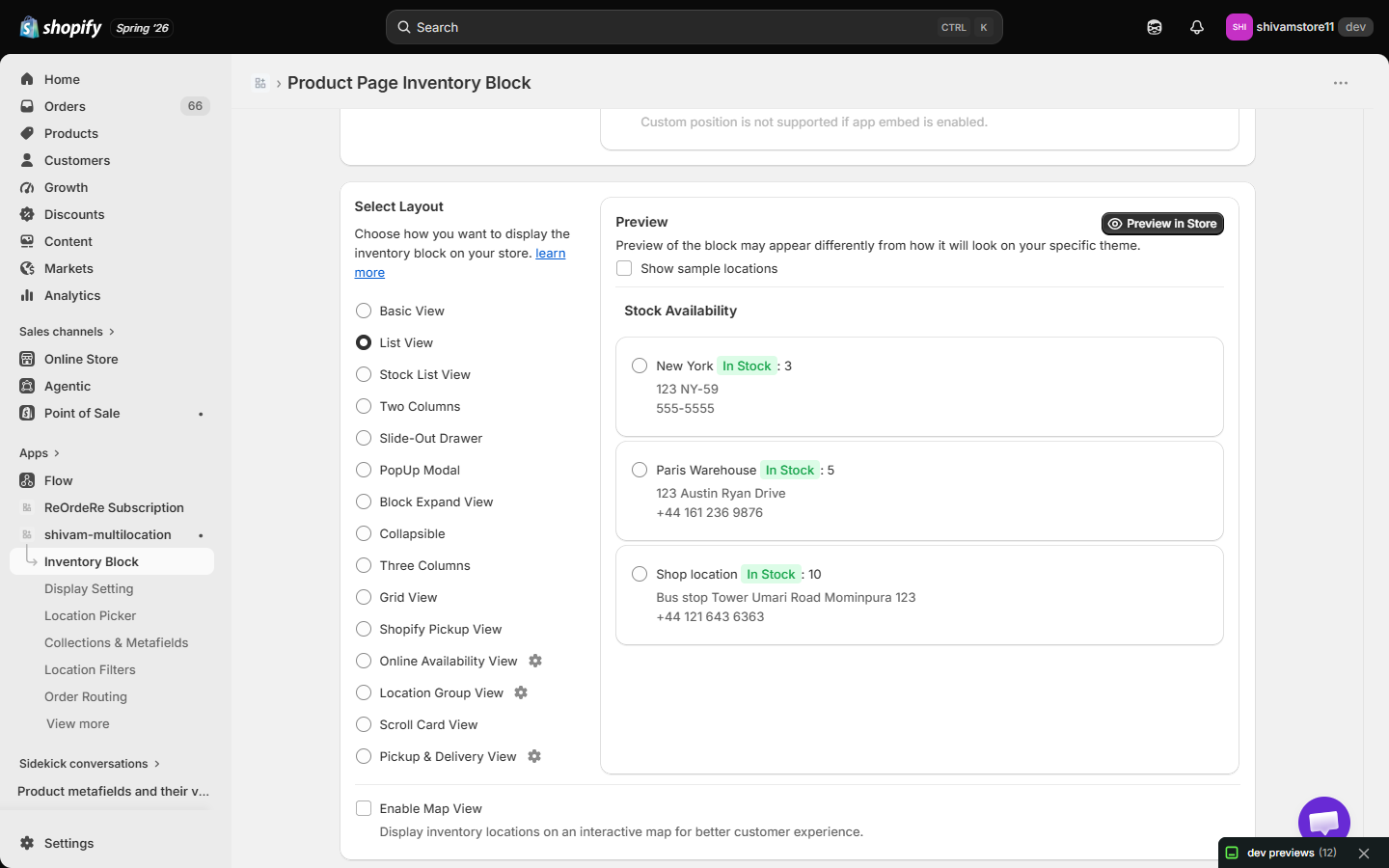
Available Views
Basic View
A simple, clean display that shows inventory information in a straightforward format. Perfect for stores that want minimal visual complexity while maintaining clarity.
Best for: Minimalist designs, quick information display
List View
Displays inventory locations in a vertical list format. Each location appears as a list item with its stock information clearly organized.
Best for: Mobile-friendly layouts, compact spaces
Stock List View
A specialized list view that emphasizes stock levels and availability. Shows inventory quantities prominently with clear visual indicators.
Best for: Stores with multiple locations, detailed stock information needs
Two Columns
Splits the inventory display into two side-by-side columns, allowing you to show more information in a compact horizontal layout.
Best for: Desktop views, maximizing space efficiency
Slide-Out Drawer
A modern interface where inventory information slides out from the side of the screen when triggered. Keeps the main page clean while providing detailed information on demand.
Best for: Modern UI/UX, space-saving designs, interactive experiences
PopUp Modal
Displays inventory information in a centered popup overlay that appears above the page content. Users can view details and close the modal when done.
Best for: Focused attention, detailed information display, preventing page navigation
Block Expand View
A collapsible block that expands to reveal inventory details when clicked. Starts in a compact state and expands to show full information.
Best for: Progressive disclosure, saving initial page space
Collapsible
Similar to Block Expand View, this view allows sections to be collapsed or expanded. Users can toggle visibility of different inventory sections independently.
Best for: Organized information hierarchy, user-controlled display
Three Columns
A three-column layout that displays inventory information across three side-by-side columns. Ideal for showing multiple data points simultaneously.
Best for: Wide screens, comprehensive data display, desktop-focused stores
Grid View
Displays inventory locations in a grid format, similar to a card-based layout. Each location appears as a grid item with consistent spacing.
Best for: Visual appeal, equal emphasis on all locations, modern card-based designs
Shopify Pickup View
A specialized view designed to match Shopify's native pickup interface. Provides a familiar experience for customers using Shopify's pickup functionality.
Best for: Stores using Shopify's pickup features, consistent Shopify experience
Online Availability View
Focuses on showing which locations have items available for online purchase. Emphasizes online stock availability and ordering options. Click its gear icon to customize the section labels: Online Location Heading (default "Online Locations"), Online Location label (default "Online"), and Physical Location Heading (default "Physical Location").
Best for: E-commerce stores, online ordering emphasis, availability clarity
Scroll Card View
Displays inventory information in a horizontal scrolling card format. Users can swipe or scroll through different location cards.
Best for: Mobile experiences, touch-friendly interfaces, limited vertical space
Location Group View
Groups your locations into custom sets (e.g. "East Coast", "Flagship Stores") and renders each group using its own template, instead of listing every location individually. Click the gear icon next to this option to configure it:
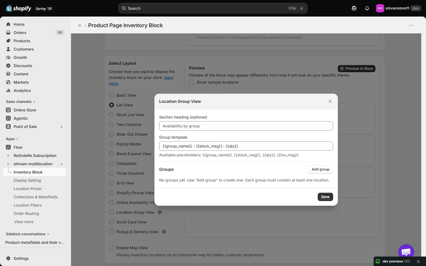
- Section heading (optional) — heading shown above the grouped list (default: "Availability by group").
- Group template — the line rendered for each group, using placeholders
{{group_name}},{{stock_msg}},{{qty}}, and{{inv_msg}}. Default:{{group_name}} - {{stock_msg}} : {{qty}}. - Groups — click Add group to create a group, name it, and select which locations belong to it. Each group must contain at least one location.
Best for: Chain stores with regional groupings, franchises, or any store that wants to summarize availability by region rather than by individual location.
Pickup & Delivery View
Presents locations split into Pickup and Delivery sections. Click the gear icon to customize the section headings:
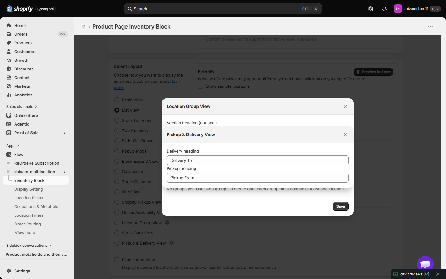
- Delivery heading — default "Delivery To".
- Pickup heading — default "Pickup From".
Best for: Stores offering both local delivery and in-store/curbside pickup.
Choosing the Right View
Consider these factors when selecting a widget view:
- Device Type: Some views work better on mobile (List View, Scroll Card View) while others are optimized for desktop (Two Columns, Three Columns)
- Space Availability: Compact views (Collapsible, Slide-Out Drawer) save space, while expanded views (Grid View, Three Columns) use more screen real estate
- User Interaction: Modal and drawer views require user interaction, while basic views display information immediately
- Design Style: Match the view to your store's overall design aesthetic
Enable Map View
Enabling map view will append the location map in the selected view. This allows customers to see the geographic location of each inventory location directly within the widget, making it easier to find nearby stores or pickup points.
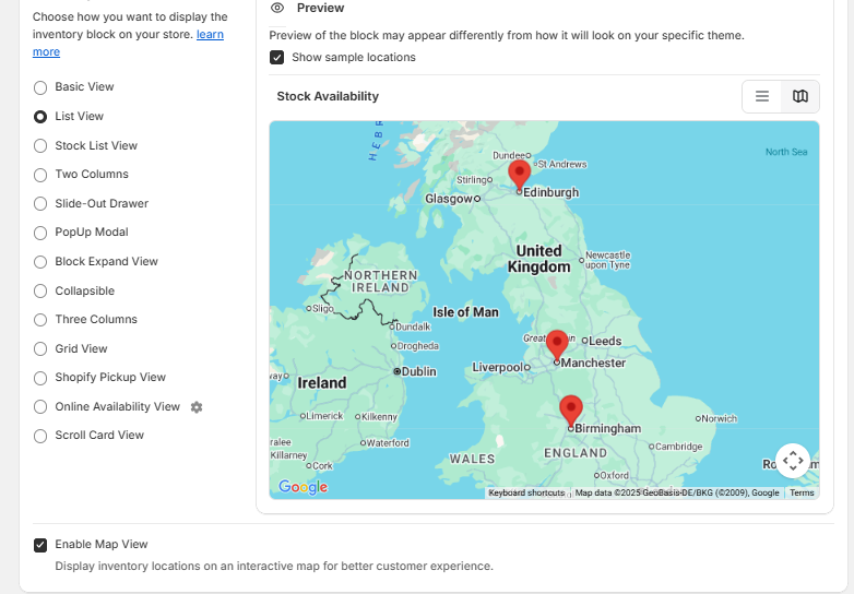
Best for: Stores with physical locations, pickup services, location-based inventory display
For inquiries, support, or assistance, feel free to reach out to us at: 📧 Email: [email protected]